III. Implications
<<
>>
My analytical approach described above is rooted in composers’ narrated perspectives and experiences. In my analysis, I investigate the “external” influences and agents acting on the invention process, and how these forces impact a webtext’s developing inscape, as experienced by webtext composers.
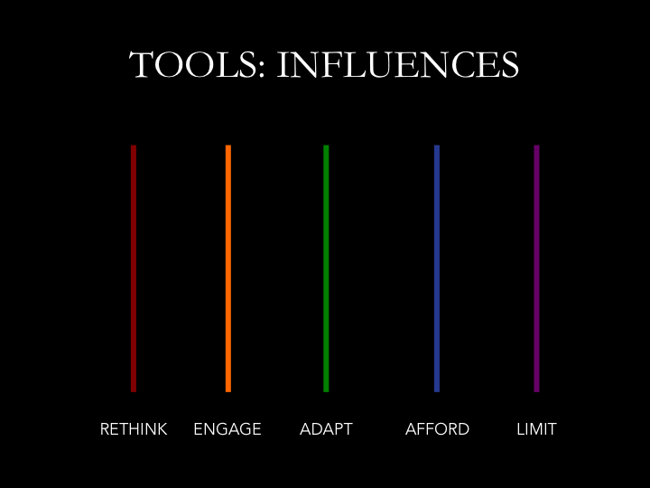
In this project, I hope to emphasize the distributed nature of digital invention (Williams and Alexander) not only among other people but among nonhuman agents as well.9 As a key participant in these composing and invention systems, I am of course deeply intertwined with each of these influences, but “people”, “tools”, and “metaphors” are all material or conceptual entities that can be clearly distinguished from myself as a separate agent. It is the nature of these three forces’ agential impacts on a webtext’s inscape (and the resulting implicit argument) that I want to trace in my analysis, as a way of accounting for the “missing masses” (Latour 1992)—human and nonhuman agents alike that play a key role “behind the scenes” in the webtext invention process. My approach deliberately keeps invention influences situated amidst messy networks of experience. “People”, “tools”, and “metaphors” provide lenses for a closer look, but the initial view makes it clear just how much contextual data has been stripped away even in a simplified cross-section of a single invention map. The process of selection is literally made visible, opened up for critique and debate but also for transparency.
I suggest two main arguments for including the inscape invention maps as part of each chapter’s analysis and discussion. First, I argue that the visualizations can challenge assumptions about the verbal nature of analysis and interpretation in order to more robustly consider multimodal analytical processes. Second, I suggest that multimodally presenting composing process data helps to effectively represent changes in inscape or structural design across drafts at a glance while immersing the reader in the contextualized data.
A. Coding and Interpretation
This project pushes back against the assumed verbal nature of scholarly communication in general and qualitative analysis in particular. Drucker observes that “[a]s a scholarly act, interpretation has almost always been textual, based on close reading, and intimately bound to the graphic form of the work to which it attaches” (180). Linguistic expression, particularly in print alphabetic form, has long been held as the primary mode for logical thinking and academic knowledge-creation, with other modes considered supplementary at best and intellectually suspect at worst (George 22, Trimbur 190). This general trend extends not only to the final form of published scholarship but also to the process of its generation.
The two recent guides to qualitative data analytical methodologies introduced earlier (Corbin and Strauss; Miles, Huberman, and Saldaña) provide cases to illustrate linguistic biases implicit in qualitative analysis. Corbin and Strauss at first glance seem less medium-dependent in their description of the process of analysis. Their analytical foundation is based on "concept," a medium-neutral term that emphasizes a cognitive entity: “Concepts are derived from data. They represent an analyst’s impressionistic understandings of what is being described in the experiences, spoken words, actions, interactions, problems, and issues expressed by participants” (51). However, their further definition for these representations of “impressionistic understandings” clearly delineates their verbal leanings: concepts are “[w]ords that stand for groups or classes of objects, events, and actions that share some major common property(ies)” (45). This definition assumes that the researcher’s cognitive processes are primarily linguistically based, and best or most accurately expressed via linguistic means. In their section on qualitative data analysis fundamentals, Miles, Huberman, and Saldaña make their preferences for verbal language explicitly clear: “So we are focusing on words as the basic medium and are assuming that the words involved have been refined from raw notes or recordings into a text that is clear to the reader or analyst” (71, original emphasis). The assumption here underlying all else that comes in their discussion of analysis is that raw data must be processed into words in order to even begin the analytical process, and that this rendering will result in greater clarity. Furthermore, all the coding strategies they suggest in the ensuing sections involve assigning further chunks of language to these already-existing verbal chunks, making the entire process one that is solely based on linguistic abstractions.
Written language is an incredibly powerful resource both for analysis and communication. It has been the foundation for academic thought and communication for thousands of years, and I don’t want to discredit its significant value as an epistemological tool. However, I do question some of the implications of relying solely on written language as a tool for thought and expression to the exclusion of all else, particularly when other modes have played key roles in generating inventive thought. Arnheim, for example, describes visual thinking as an important aspect of the “crucial thought operations of discovery and invention” (vi) and highlights the creation of visuals as a way to work through complex conceptual problems via drawing or making things (119). In particular, he notes: “What we need to acknowledge is that perceptual and pictorial shapes are not only translations of thought products but the very flesh and blood of thinking itself and that an unbroken range of visual interpretation leads from the humble gestures of daily communication to the statements of great art” (134). If Arnheim is correct that visual shapes are “the very flesh and blood of thinking itself,” then it is extremely reductive to assume a qualitative data coding system based solely on linguistic coding to the exclusion of all else. My approach attempts to incorporate visual thinking (by using icon-codes) into the very act of qualitative data analysis and coding. My approach (use its formal name here) mobilizes the affordances of digital technologies to expand possible conceptual resources for data analysis.
This is not to say that language doesn’t play any role in my qualitative analysis, far from it—after all, so many of my notes were language-based, and my reflective narratives are obviously linguistic renderings of remembered experiences. What I want to emphasize instead is that the process of moving across media channels is essential to analysis in this case—not solely language, but language plus images plus videos and so forth. Drucker highlights the analytical benefits of moving across multiple media in the act of interpreting data: “The antidote to the familiarity that blinds us is the embrace of parallax, disaggregation of the illusion of singularity through comparatist and relativist approaches, and engagement with fragmentation and partial presentations of knowledge that expose the illusion of seamless wholeness” (179). My analytical approach foregrounds this migration across media that Drucker describes. It was only in working across these modes and channels that I was able to generate these codes and categories, whereas if I had stayed in a language-based analytical form the results would have been very different—still very grounded in the data, but less holistic in working toward an overall view of the webtext composing process. Thus, both my data engagement process and my analytical visualizations work across modes to generate new insights about my data corpus.
B. Data Representation
I argue that my icon-coded visualizations are a useful way to systematically condense and summarize a complex array of information about the reasons behind change over time. The visualizations not only show the codes and categories that emerged out of this process, but also map an argument that can be taken in at a glance for the way that they interrelate. It is one thing to describe analytical codes for people, pieces, and impacts; it is another to map them out in the same space, in a way that approximates the interface real estate of the draft itself. These visualizations are a way to see the accumulation of change across time over multiple drafts, and to account for the social or technological or metaphorical impact behind a particularly salient localized change. They may take a little additional time to work through in order to fully understand the concepts each icon variation represents, and the claims being made with their particular setup. However, considering that they are a way of distilling and representing claims about a dataset spanning several months, they are still a fairly concise summary for taking in contextualized patterns of change over time at a glance.
Through illustrated inscape invention maps, I seek to represent “assessments of change, dynamics, and cause and effect”—which, according to Tufte, are “at the heart of thinking and explanation”—through systematic visual representation strategies (9). These representations symbolize “pictures of verbs, the representations of mechanism and motion, of process and dynamics, of causes and effectives, of explanation and narrative” (10) insofar as they relate to invention influences in the process of webtext design. The multiple case study drafts “reveal repetition and change, pattern and surprise—the defining elements in the idea of information”, and “create visual lists of objects and activities, nouns and verbs, helping viewers to analyze, compare, differentiate, decide” (105). The images are representations of qualitative rather than quantitative data, and as such they offer an interpretation of interrelated dynamic processes—of relationships between impacts and agents—in a way that is supported by but not limited to numerical representation of codes and categories.
In particular, I want to highlight the benefits of using simple geometric shapes to map complex changes in data over time, even if they are slightly challenging and time-intensive to read. As Arnheim notes, “Simple line drawings can give visible shape to patterns of force or other structural qualities […] Images, then regard the world in two opposite directions. They hover somewhere above the realm of ‘practical’ things and below the disembodied forces animating these things. They can be said to mediate between the two” (135). This is precisely what the geometric shape-illustrations are intended to communicate when used as a visual coding and data representation strategy—to mediate between the actual reality of the data as collected in the autoethnographic drafts and notes, and my conceptual interpretation of the “patterns of force” acting on these drafts in order to cause changes in the design. The inscape invention maps made up of icon-codes are thus both systematic abstract representations of forces and structural qualities behind digital composing processes as well as representational of aspects of the drafts themselves.
This work in visual abstraction to facilitate public engagement with a complex body of data has begun to be explored in other venues and contexts as well. Singh describes the rise of “data comics” as a resource for showing data sketches that were part of a researcher’s process in developing their analysis, and that might never otherwise see the light of day. For example, Singh highlights data comics’ potential to communicate sophisticated information such as “complex temporal patterns” through distilling the primary information that needs to be included to tell the story, with footnotes and annotations included for readers interested in more of the background information that had to be excised (4). He notes that the term “comic” can be used loosely in order to describe an emerging visual genre: “Characteristic, I think, is simplicity, linearity, and the combination of pictures and text, which together create a rich design space for presentation and narrative techniques” (5). In this regard, I align the visual-verbal representations created in my analysis as one possibility for what emerging comics might look like as a way of facilitating user engagement with complex data, particularly that which depicts forces of change across time.
<<
>>